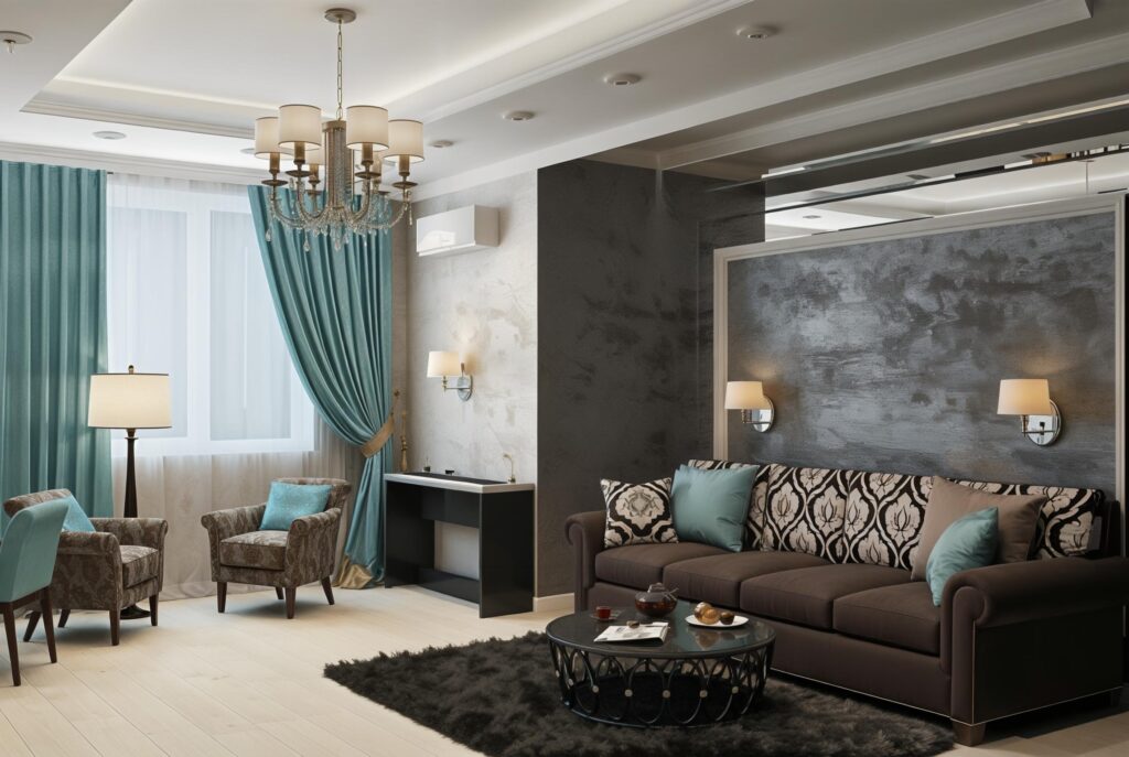
How to Choose a Color Palette for Your Interior Design

At Maparc Associates, one of the most common questions we hear is:
“How do I choose the right color palette for my interior design?”
And it’s a great question. Choosing the right interior design color palette is more than just picking pretty shades—it’s about creating a space that feels cohesive, inviting, and uniquely yours.
In this guide, we’ll walk you through the process of how to pick an interior design color palette that not only looks beautiful but also supports the function and mood of your home. Whether you’re decorating a rental or your forever home, the tips below will help you build a color scheme that works.
Why a Color Palette Matters
Your home interior color palette sets the tone for everything that follows in a design project—from furniture and textiles to accessories and lighting. It’s the thread that ties your entire home together.
A well-chosen palette can:
- Enhance natural light
- Establish emotional tone (calm, energetic, cozy)
- Make spaces feel more spacious or intimate
- Add sophistication and depth to a simple room
How To Combine Colors In Your Home and Look Cohesive
To create a cohesive look, follow these tried-and-true design principles:
Step 1: Take Stock of Existing Elements
Before you pick up a paintbrush or scroll through color swatches, observe your current space:
- Architectural details (wood floors, stonework, trim)
- Existing furniture or statement pieces
- Artwork, rugs, or lighting you want to keep
Pro Tip: Not everything has to match, but it should coordinate. For example, if you have matte black dining chairs with copper legs, consider using black as a grounding neutral and copper as a warm accent.
Rental-Specific Advice
Renters often face unique limitations. If you can’t make permanent changes, you can still:
- Use peel-and-stick wallpaper
- Layer in large area rugs
- Apply removable contact paper on cabinets
At Maparc, we once embraced a dated tile floor by designing a palette around it—turning a potential eyesore into a statement feature.
Step 2: Go on a Pinning Spree (Visual Research)
Create a Pinterest board or save images that inspire you. Look beyond interiors—consider nature, art, fashion, and food photography.
Ask:
- What colors repeat across my saved images?
- Are they warm or cool tones?
- Do I gravitate toward soft neutrals, bold primaries, or earthy shades?
These visual patterns reveal your color instincts, and they’re your best guide.
Step 3: Ask How You Want to Feel
Color has a psychological impact. Ask:
“What do I want to feel when I walk into this room?”
| Desired Mood | Suggested Tones |
|---|---|
| Calm & Relaxed | Sage, Beige, Dusty Blue |
| Energized & Bold | Terracotta, Mustard, Emerald |
| Timeless & Elegant | Black, Navy, Cream, Soft Gray |
This emotional filter helps you narrow your palette to colors that feel right.
Step 4: Choose 3 to 5 Core Colors (The 3 Color Rule in Interior Design)
A well-balanced interior color scheme often follows the 3 Color Rule:
- Primary Color (60%) – Walls, large furniture pieces
- Secondary Color (30%) – Rugs, curtains, textiles
- Accent Color (10%) – Decor, lighting, pillows
You can expand this to up to 5 shades, including different tones of the same color (e.g., light sage + forest green).
Step 5: Use Color Palette Generator Tools
Need help pulling together shades that work? Try these tools:
- Coolors.co – Generate a palette from any photo
- Canva Color Palette Generator – Drag and drop a favorite image
- Pantone Studio App – Explore high-end, professional matches
- Color Hunt – Browse trending and curated palettes
These tools are especially useful when working from an inspiration photo.
Step 6: Pick 2 Dominant Colors
From your palette, select two key tones to dominate your space.
| Style | Key Color Ideas |
|---|---|
| Minimalist | Warm White, Light Gray, Sand |
| Eclectic | Forest Green, Cobalt, Rust |
| Classic | Navy, Cream, Taupe |
These core colors will be your walls, major furniture, or cabinetry.
Step 7: Add Accent Colors
Accent colors add personality and prevent the space from feeling flat. You’ll use them in:
- Throw pillows
- Artwork
- Lamps or vases
- Upholstery and small furniture
If your base colors are neutral, your accents can be bold—think brass, burgundy, emerald, or indigo.
Real-Life Palette Examples from Maparc Associates
| Key Colors | Accent Colors | Mood & Style |
|---|---|---|
| Warm White + Olive Green | Brass, Terracotta, Dusty Pink | Cozy & Earthy |
| Navy + Soft Gray | Mustard, White, Warm Wood | Modern & Masculine |
| Taupe + Cream | Black, Rust, Deep Green | Sophisticated & Textural |
| Charcoal + Off-White | Copper, Forest Green, Beige | Bold & Balanced |
These palettes were crafted to reflect different personalities, room sizes, and lighting conditions.
Final Thoughts: How to Choose a Home Interior Color Palette
Selecting the right home interior color palette is part art, part science. It’s about balancing personal taste with practical considerations.
Start by:
- Understanding your space
- Listening to your instincts
- Using tools and photos to build a clear, cohesive plan
At Maparc Associates, we believe your home should tell your story—and color is the language that brings it to life.
Need Help Choosing Your Interior Colors?
Whether you’re struggling with a rental’s limitations or planning a full redesign, Maparc Associates offers custom color consultations tailored to your space, style, and goals.
Let us help you create a palette that feels just right.
Get in touch today to begin your transformation.